
Innovexaldt
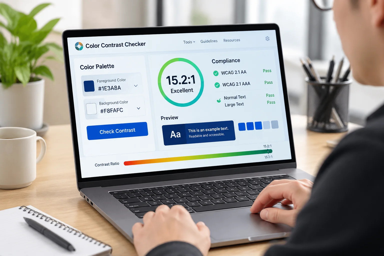
We track our progress through rigorous testing metrics to ensure every project we touch reaches a higher standard of usability and functional excellence.

Digital accessibility is the practice of designing and developing websites and mobile applications so that people with a wide range of abilities can perceive, understand, navigate, and interact with them. When interfaces are built with inclusivity at their core, they become more robust and usable for everyone, regardless of their physical or sensory limitations. This approach moves beyond simple compliance, fostering a digital environment where information is accessible to all users.
The WCAG guidelines serve as the foundation for these efforts. These internationally recognized standards provide a structured framework for evaluating the accessibility of digital content. By following these benchmarks, teams can systematically identify and remove barriers that prevent users from engaging with their products. Understanding these rules is the first step toward creating a more equitable web experience.
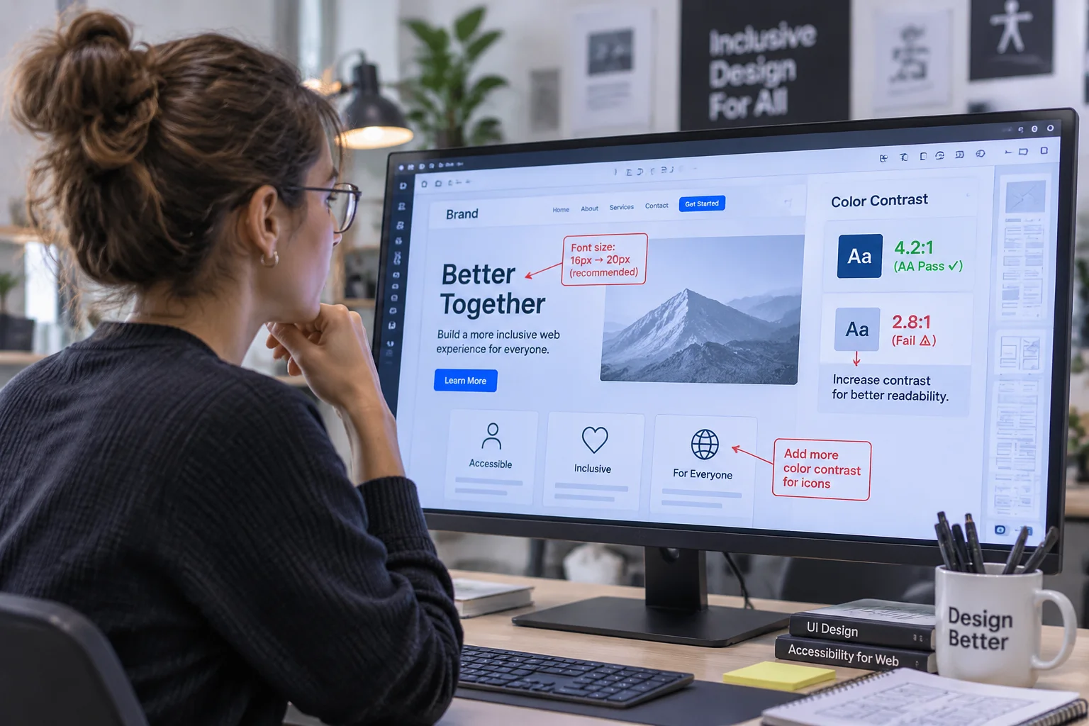
Text contrast and font sizing are fundamental components of an accessible interface. When color contrast ratios fall below recommended thresholds, users with low vision or color blindness often struggle to distinguish text from background elements. Implementing high-contrast color palettes ensures that information remains legible in various lighting conditions and across different screen types.
Typography also plays a significant role in readability. Using scalable fonts allows users to adjust text size according to their personal needs without breaking the layout of the application. Maintaining clear hierarchy and adequate spacing between lines further improves the experience for users who rely on screen magnifiers or simply require more clarity to process information efficiently.
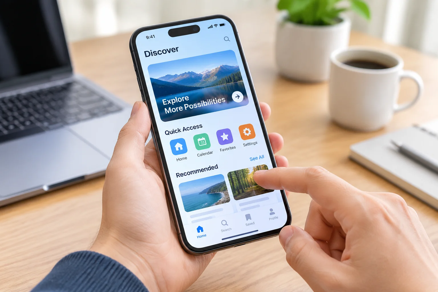
Mobile applications present unique challenges regarding touch target sizing and navigation. Small buttons that are placed too close together can lead to accidental inputs, which is particularly problematic for users with motor impairments. Designers should adhere to minimum size requirements for touch targets, ensuring that every interactive element remains easy to activate with a single tap or gesture.
Beyond physical sizing, the placement of navigation elements influences how easily a user moves through an application. Placing frequently used actions within easy reach of the thumb reduces physical strain and improves the overall usability of the interface. Thoughtful placement creates a more intuitive flow, allowing users to focus on the content rather than struggling with the mechanics of the application.
Screen reader support is perhaps the most critical aspect of accessibility for users with visual impairments. These tools rely on well-structured code to interpret the content of a page and describe it accurately to the user. Proper use of semantic HTML and descriptive labels for buttons and images ensures that assistive technology can correctly identify the purpose and function of every interface component.
Providing meaningful alternative text for non-text content is essential for a complete experience. When images or icons lack descriptive labels, users of screen readers miss out on vital context. By investing time in creating accurate, concise descriptions, developers can ensure that the narrative and functional intent of the application are communicated effectively to every visitor, regardless of how they access the platform.
Keyboard accessibility is essential for users who cannot use a mouse or touch screen. This includes individuals with motor disabilities as well as power users who prefer keyboard shortcuts for efficiency. A logical tab order allows users to navigate through menus, forms, and buttons in a predictable sequence. Ensuring that the focus indicator is always visible helps users keep track of their position on the page.
Testing keyboard navigation requires simulating the experience of moving through an entire application without a pointing device. If a user cannot reach a specific form field or trigger a drop-down menu using only the keyboard, the interface fails to meet basic accessibility requirements. By prioritizing these interactions, developers can build more resilient applications that accommodate a wider range of input methods and user preferences.
Accessibility is not a final checklist to be completed once, but a continuous process of refinement. As new technologies emerge and user needs evolve, the approach to digital design must remain flexible and responsive. By integrating these practices into the daily workflow, organizations can build products that are not only compliant but truly welcoming to all, ensuring that the digital landscape remains open and inclusive for every individual.




Address Location: 8 Edisher Maghalashvili St., Tbilisi 0186, Georgia
Mailing address: [email protected]
Comments